- 首页
- International
- 艾特奖
- 文化节
- 服务体系
-
网站导航

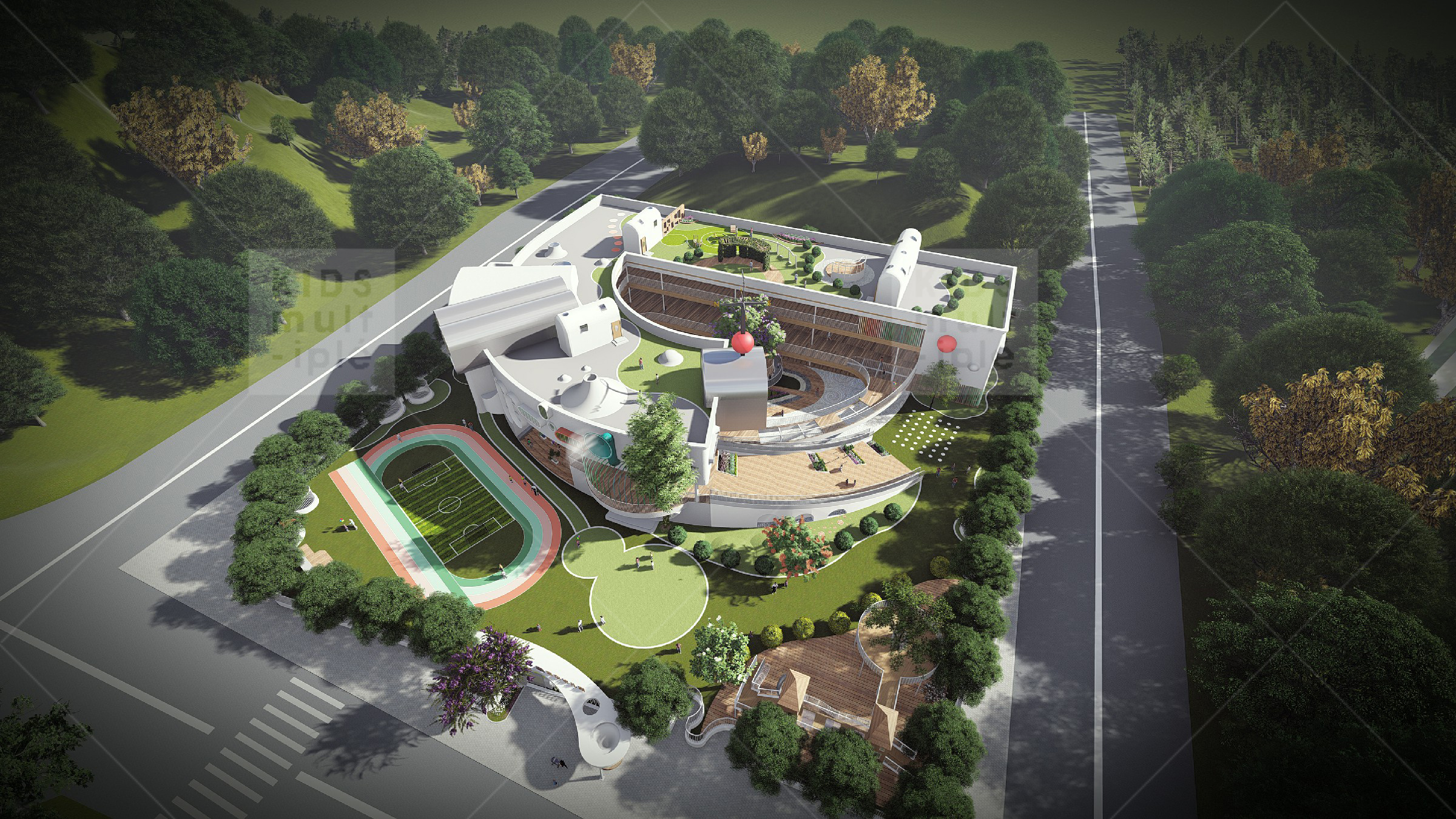
“长兴H31幼儿园”位于陕西省安康市高新区,作为“一体两翼”的核心区、产业聚集区和综合城市新区,是幼儿多样化成长的宝贵之地。KIDS设计师从造型等方面对该建筑进行合理的改造设计,将幼儿的生活映射的如同童话一般,住在自己的城堡里,体验每一刻的不可复制。 "Changxin H31 kindergarten" is located in Ankang hi tech Zone, Shaanxi province. As the core area of "one body, two wings", the industrial gathering area and the new comprehensive urban area, it is a valuable place for children's diversified growth. KIDS designer from the shape and other aspects of the building for a reasonable transformation design, the children's life mapping like a fairy tale, living in their own castle, experience every moment can not be replicated.

墙面以弧形造型设计为主,修饰整个墙面,体现出幼儿天生活泼的形象。搭配顶面的造型设计,通过对空间的灵活化使用,在功能上对不同空间进行定位,丰富幼儿教育空间的教学内容。 逐渐丰富幼儿内心的心理素质,逐渐的学习科学文化,遵循“德、智、体、美”的全面发展。 The wall is mainly designed with arc shape, which decorates the whole wall, reflecting the image of children's lively life. Matching the top surface design, through flexible use of space, positioning the different spaces in function, enriching the teaching content of preschool education space. Gradually enrich the psychological quality of children's heart, gradually learn scientific culture, follow the comprehensive development of "morality, intelligence, body and beauty".

墙面色彩以暗蓝色为主,设计师克制地运用着色彩,以粉红色、黄色与白色作为设计的三原色,以点缀对比的手法激发轻松的有趣的活泼氛围。使幼儿积极的运用语言进行交往,帮助他们积累运用语言的技能,培养幼儿初步的交往技能及语言能力。 Wall color is mainly dark blue. Designers use color with restraint. Pink, yellow and white are the three primary colors of the design. Hand strokes with contrast and embellishment stimulate a relaxed and interesting lively atmosphere. Make children actively use language to communicate, help them accumulate the skills of using language, and cultivate children's initial communicative skills and language ability.

顶面采用色彩相碰撞设计,如同一条彩带将室内各空间界面联系起来,加强空间的整体性,尊重设计的使用方充分理解设计师的设计理念,通过与空间的互动、适应与调整,对设计进行二次升华。灵活地融入丰富的教学、与交流活动,让孩子们在空间中尽情享受着体验探索的乐趣。 室内教学单元中,光线透过窗台的窗框,被分割为一个个错动的长方形,以不同寻常的窗设计启发孩子的创造力。而顶面采用条形灯光光影设计,让孩子们情不自禁地仰望,思考、探索着这神秘斑斓的光。室内以简洁的白色搭配暗驼色设计,如同大地给予的情感,温柔而充满暖意。它是开放的,自然的,自在的,是一个可以借此而突破自我界限的机会。 In the indoor teaching unit, light passes through the window frame of the window sill and is divided into distorted rectangles to inspire children's creativity with unusual window design. The top is striped light and shadow design, so that children can not help looking up, thinking, exploring this mysterious light. The interior is designed with simple white collocation and dark camel. It is gentle and warm as the emotion given by the earth. It is open, natural and comfortable, an opportunity to break through self-boundaries. Collision design is adopted on the top surface, which is like a ribbon linking the interior space interface, strengthening the integrity of the space, respecting the use of the design, fully understanding the design concept of the designer, and sublimating the design through interaction, adaptation and adjustment with the space. Flexible integration of rich teaching and communication activities, so that children in space enjoy the pleasure of experience and exploration.

商业街设计 商业街氛围营造 品牌形象设计


海南 会展 公建
零壹城市 零壹城市建筑事务所 LYCS

商业街改造设计 旧街区设计 商业业态规划
商业综合体设计 商业规划设计 空间设计