- 首页
- International
- 艾特奖
- 文化节
- 服务体系
-
网站导航
墨尚新概念办公_室内展示空间
项目名称:墨尚新概念办公_室内展示空间
设计公司:意匠建筑设计有限公司
设计总监:陈曦
设计团队:郝佳、冉鑫、徐江欣
设计时间:2018年7月
完工时间:2019年3月
空间面积:430㎡
墨尚是九零后老板的自主独立品牌,旨在整合零散分布的各类与办公相关的家具、设备、软装以及其他产品等,塑造高效快捷、环保节能、人性舒适的办公空间。墨尚办公空间展厅就是这个想法的一个初步实践。
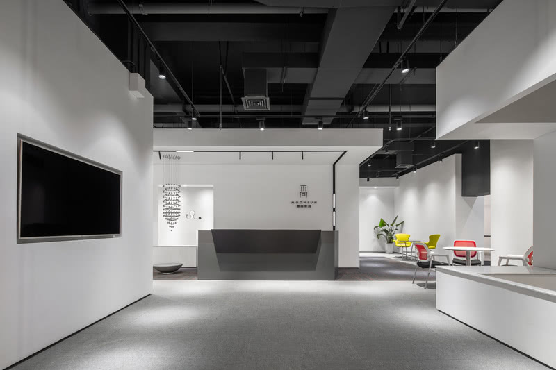
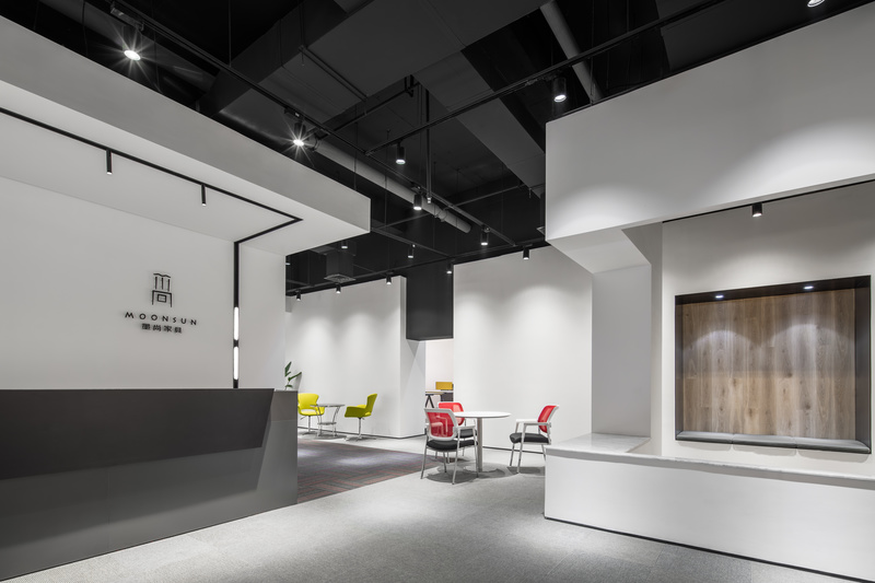
展厅位于西安的知名家居卖场内,实用面积约四百三十平米,整体分为前台接待区、休闲洽谈区、多人开放办公区、会议区、独立办公区和新概念产品体验区等。展厅的特色在于新概念的空间格局,摒弃传统家居展厅的卖场式布置,设计将这六块主要功能区域灵活穿插在整个场地中,并且巧妙的回避了柱子和剪力墙等建筑结构构件,似乎是几组设计精巧的白色礼盒从天而降,定义出白色内外的不同空间,同时也定义出不同的功能区域。
整个展厅流线从入口玄关处开始向左向右都可以一条流线贯穿,不走回头路。此外,一方面白色礼盒根据动线和视线需要,考究的设计开洞,也融合坐立休憩展示等实际功能,利用视线穿透不断引导参观者前行,另一方面展厅中植入微景观和精巧的软装陈设,给重要节点视角借景或对景,制造出参观的节奏和兴奋点,达到类似传统造园中步移景异和通而不透的空间层次。展厅用材尽量简洁,白色漆面、灰色系块毯和少量的木地板,不仅是造价控制,更是为了使整个展厅环境素雅并能突出展品,所谓绘事后素。
Moshang new concept office _ interior exhibition space
Moshang is an independent brand owned by a post-90s, aiming at integrating all kinds of office related products, such as furniture, equipment, soft decoration, soft outfits and others, to create a efficient, highly active, environment-friendly, energy-saving and comfortable office space. Moshang office space exhibition hall is a preliminary practice of this idea.
The exhibition hall is located in a famous home furnishing market in xi 'an, with a practical area of about 450 square meters, which is divided into reception area, leisure negotiation area, open office area, conference area, independent office area and new concept product experience area. The feature of the exhibition hall lies on its spatial pattern, which abandons the traditional household stereotypes, setting the six major functional areas in the whole field flexibly, and skillfully shied away from the column and shear wall structure components. The design is like several groups of well-designed white gift box coming from above, specifying different room space, but also the different functional areas.
From the entrance porch, no matter turning left or right can both visit the entire exhibition hall in a stream-lined line without return. In addition, on the one hand, white gift boxes based on the requirement of kinetonema and sight line, together with its artful open holes and practical functions used as rest and representation to guide the visitors moving forward through their eyesight. On the other hand, the exhibition hall is set up microlandshafts and some delicate outfits, creating the important nodes during visitation, achieving the same dimensional administrative levels in traditional build gardens. Exhibition hall uses concise material, white lacquer face, gray blanket and some wooden floor, not only economy, but also highlight the simple but elegant environment.

入口

前厅

前台